JUNE: open-source individual-based epidemiology simulation
Modelling, Data Analysis, Data Visualisation
This will be more of a blog-type post detailing what the project was like from my personal perspective, rather than being a summary of the project. I have since left the JUNE collaboration, which I believe still has ongoing projects.
During the start of the global pandemic of 2020, the Institute for Data Science (IDAS-Durham) at my university took the initiative to kickstart a cross-disciplinary team to tackle the challenge of creating an individual agent-based epidemiology model, JUNE, to investigate the different levers affecting the spread of the infectious disease in England – I’m not saying Covid here because JUNE is in principle generic and is flexible for any infectious disease.
The project took off quickly with roughly a ten person team, a mix of postgraduate students and some faculty staff, working on different facets of the model. Our philosophy was to use publicly available, well-documented, data sources to create a digital twin of England, spatially and temporally. Most of the data was obtained from the Office for National Statistics (ONS) which archived the census data from 2011 (unfortunate timing since the next census would have been 2021), which allowed us to create a mock England. Some examples of data used includes: the age distribution of the country, the housing environments, and the workforce distribution. Additional data was used to model how people spent their time during the day and night, how they travel to and from work, and how intimate interactions are between different age groups. All of this is to say we tried to model how humans behaved in a society with data publicly available. You can read more about the construction of the digital twin in our method paper here.
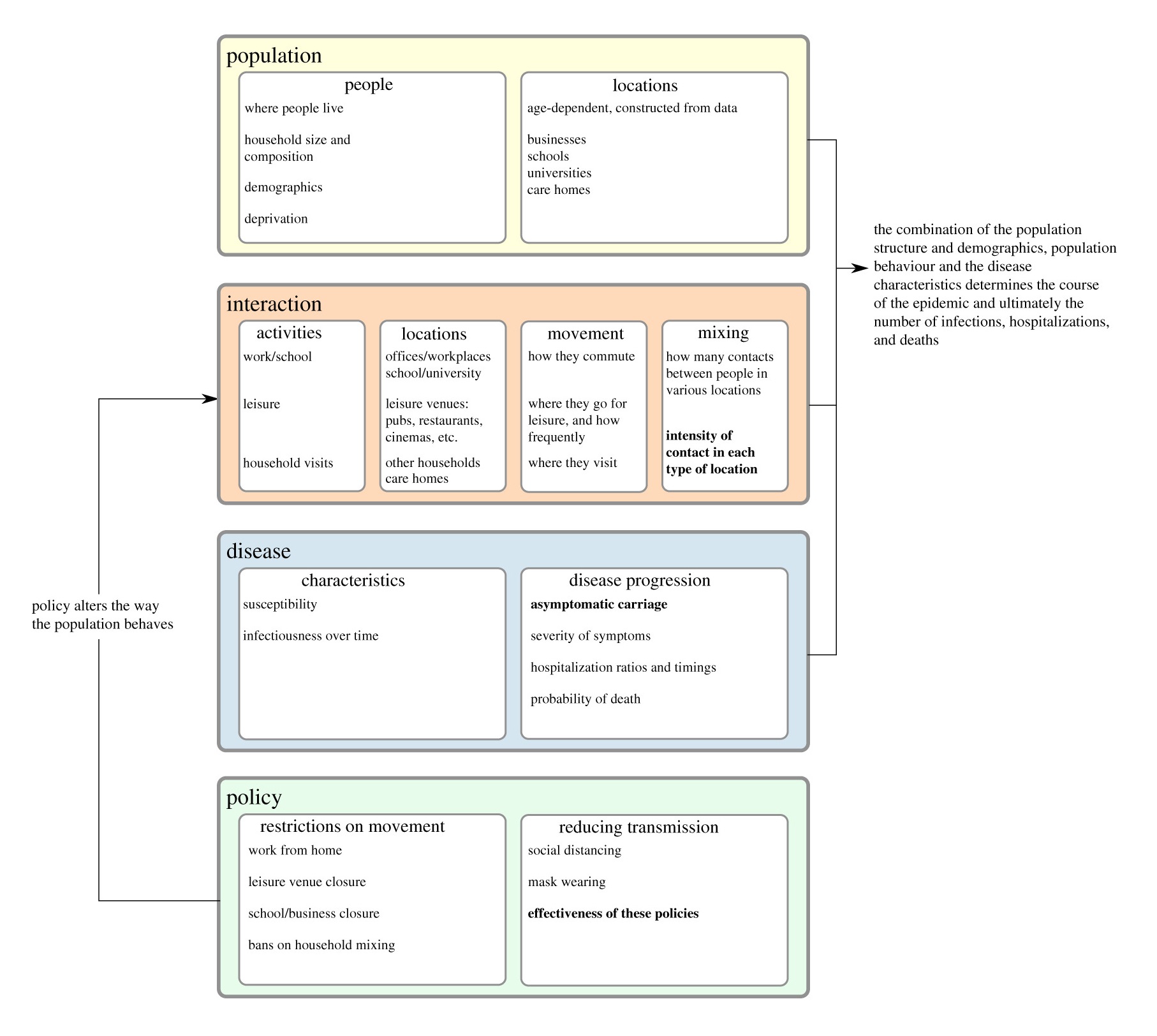 An overview of the structure of the model, where the coloured boxes indicate the different modules of the code. Parameters which are fitted to data are typeset in bold.
The simulation itself is written in Python as all the grad students at the time, most of whom had a background in physics, were most comfortable with Python. Subsequent multiprocessing optimisations would take place to make the code more speedy. The code is publicly available at the GitHub repo:
The model, whilst data, driven has to be calibrated to observed data. That is to say we tune the parameters of the model (see the Figure above for some examples) in order to match hospitalisation and deaths time series data as closely as possible, for each region of England, and for each age bracket in the data. This is an extremely challenging task as the model has a large numbner of parameters meaning there are degeneracies in how they can fit the empirical data. Furthermore, people’s behaviour is not isotropic across the country, and the data was often incomplete or noisy (it was not uncommon for data to be misreported and corrected later) – we accounted for these factors with additional parameters in the model.
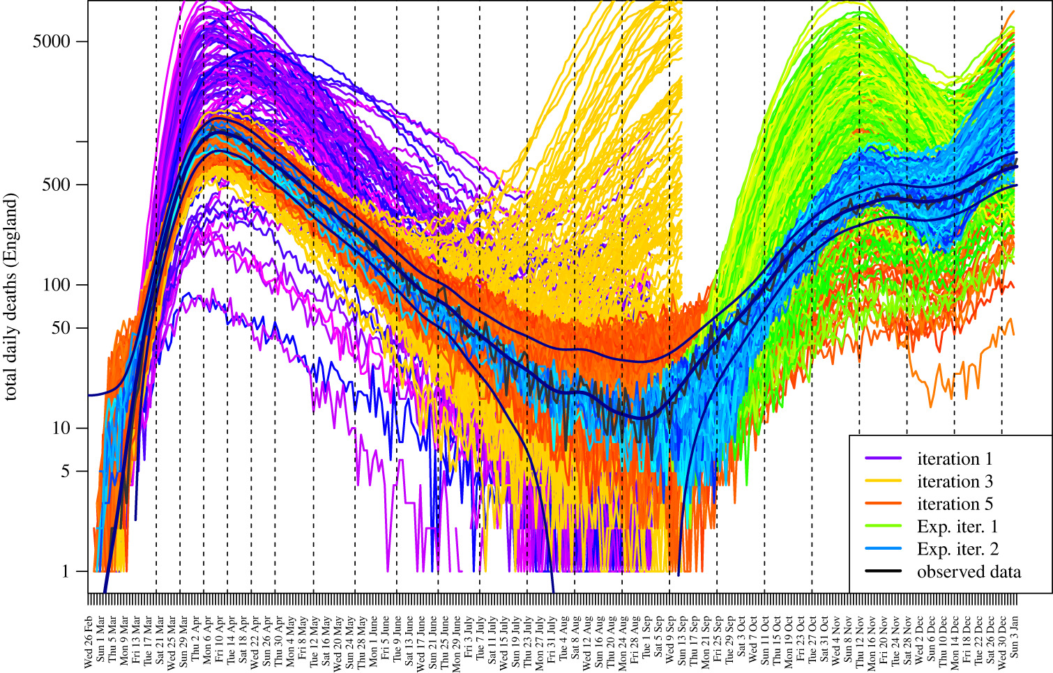 JUNE total daily deaths in England in 2020 for several calibration steps. Observed data is from ONS.
To calibrate the model we use a Bayesian emulation of the full model and history matching, you can read more about that in the paper here. In short, we take hundreds of samples from the large multidimensional parameter space with an efficient sampling algorithm (latin hypercube in this case) then run replica models with the sampled parameters. We extract the region and age stratified results from the model outputs and compare them with the empirical data. The emulation model then informs us of which regions of the parameter space to search next based on non-implausibility measures. The procedure is repeated until we reach an acceptable match with reality. Let’s call one iteration of this procedure a calibration step.
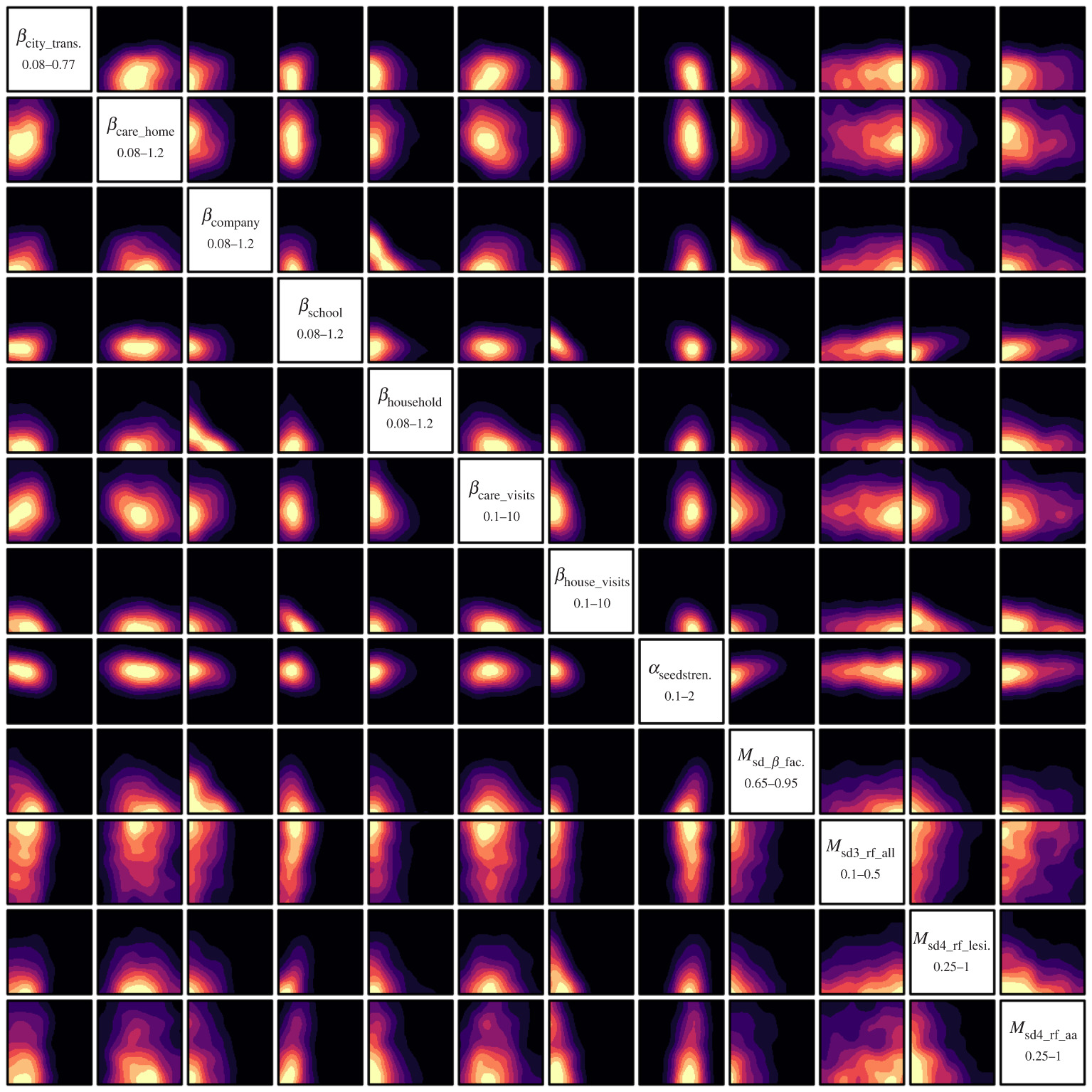 2d projections of the 12 most constrained input parameters. This plot shows the non-implausible regions of where good runs are going to be found. In other words, the yellow regions are where you would search to improve your chances of finding the parameters which the model should be run with to fit the data most closely.
While I contributed to the initial stages of writing the code for JUNE, I was chiefly responsible for actually running the model and figuring out how to extract meaningful summary statistics from the model outputs, all as automated as possible. You can imagine that with an individual based model of England, 50 million people’s data (age, housing situation, occupation, health status, infected status, etc.) was stored in a database each time we ran the model, meaning it would not be too useful to look at each and every point of data. This doesn’t even begin to touch on the practical problem of having to run the model hundreds of times for each calibration step, of which there were many. JUNE is extemely memory hungry as it is an individual agent-based model, for instance, the simulation for England takes about 100 GB of RAM.
To circumvent some of these issues, we streamlined the model outputs to only output dynamic data that is modified during the simulation, e.g. infection status, hospitalisation status, etc. This means that we can split off the static data into a single database as that is only dependent on the mock England we create. This made the data extraction (performed with Pandas) much more efficient as we didn’t have to spend time on reading the static data each time we wanted to create a run summary. We would only have to read it one time then perform a merge with the dynamic data, which then allowed us to extract and stratify to produce daily/weekly/regional/age summaries of the time series data.
Some more small things I learnt about Pandas was to avoid using row operations as much as possible as this is much slower than column operations. For example, we initially were checking if people were infected by counting the number of people with the ‘infected’ tag. However, since we were already recording the number of people susceptible, the number of infected people would just be the negative of this. This changed the operation from a lambda on each row to a single column subtraction. This is just an example of the types of optimisation we performed to improve performance.
Given that JUNE required a large amount of RAM to run, it was infeasible to run it on our personal computers, so we had to enlist the help of supercomputers. Fortunately, we had access to COSMA5 (which was always full) at the ICC as well as the Worldwide LHC Computing Grid (the grid) due to our academic research positions. Since I’m a particle physicist I was responsible for using the grid, which is specialised for highly parallel, low memory jobs, for our epidemiological simulation.
In order to run JUNE on the grid there were a few steps to consider. The grid’s storage element for large files is separate from its computing elements. This meant that I had to upload the mock England and the model code along with a Python virtual envionment to the grid storage (gfal) which were then downloaded for each job, which itself runs in a sandbox. Another complication was in ensuring that each parallel run was running with the correct parameters. This was solved by uploading a simple compressed NumPy file which would be read from for each job, indexing with an assigned job seed. Once a job was complete it would upload the summary statistics to gfal, which I then downloaded to produce plots. I modified the ARC submission wrapper software, pyHepGrid, written by ex-IPPP students for their particle physics research, for running JUNE:
So all good right? Not quite. The grid worked for us for a while but it quickly became apparent that the jobs were running too slowly as the code was not parallel at this point, and that by design the grid is mainly useful for single core, low memory jobs– the opposite of what JUNE requires. This meant that jobs running on single cores were skipping past JUNE in the queue as JUNE required blocks of nodes. Turnaround for each calibration step was on the order of days to a week which was far too long for such a time sensitive project. Enter Hartree, an STFC-funded supercomputer! Hartree is in my eyes a much nicer platform for this project as firstly, there were many more computing nodes, and secondly the storage elements were directly accessible by the computing element. Each scafell-pike compute node had 32 cores and 128 GB RAM, meaning that we could make use of JUNE’s parellel code to full effect.
Setting up runs on Hartree was much more straightforward due to the physically connected storage elements. It was simply a case of copying across the digital twin, JUNE code, virtual environment, and parameter files to the storage. The parallel runs would then run from these files and output to the same storage. No need for copying/downloading/uploading. Using Hartree sped up the runtime of each calibration step from days to just over 10 hours (the run time is of course dependent on the simulation length – at the time we were mainly running from March 2020 to the summer). I’m afraid to look at the total amount of CPU hours used for this project… However, you do get cool looking plots like the ones below.
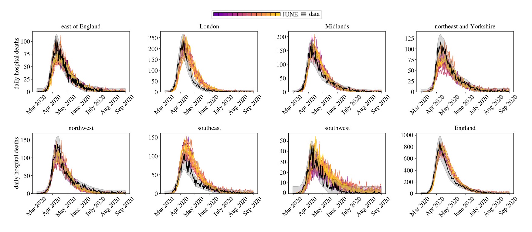 Daily hospital deaths for each region in England from a select few realisations of JUNE. Data from CPNS.
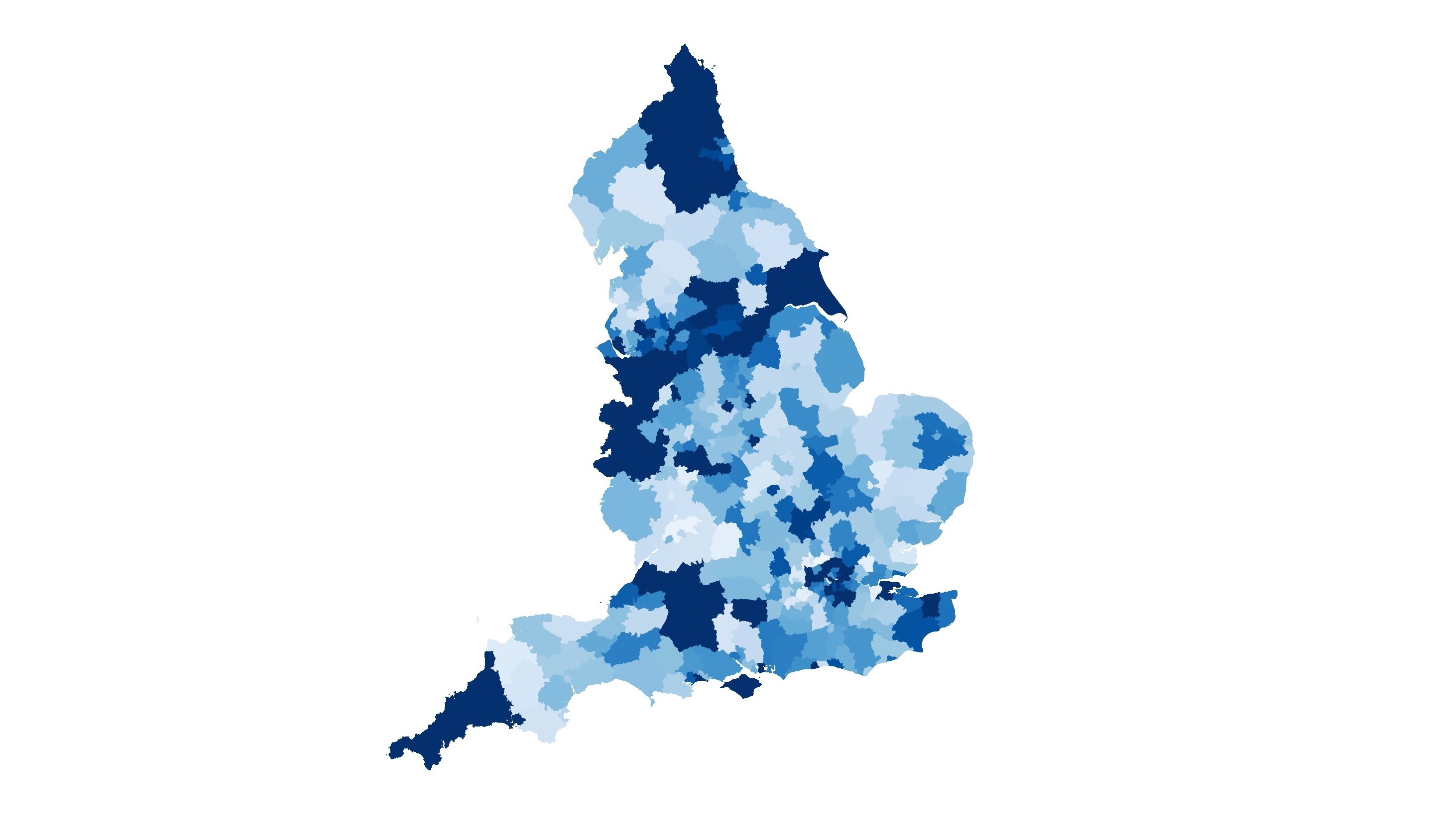
For running data analysis, I abused the COSMA login nodes with parallel Python scripts thanks to gnu-parallel. Sometimes it is easier to just run many scripts, rather than to make the script faster. The extracted run data could be used to analyse various thing. From investigating locations of infection hotspots, to the effectiveness of certain intervention strategies. An example of some cool things you can do with JUNE is the following video: it’s a comparison of cumulative deaths in local authority districts compared with observed data (disclaimer: this is not predictive, it’s for illustration purposes only).
I made the video by first plotting the data with geopandas using the publicly available local authority district shape files (like those here). Since we know where people live during the simulation, we can group the simulated individual’s location into the corresponding locations in the shape file and extract who died on each day. Once I had the images for each day, I used ffmpeg to string together the images to turn it into a video.